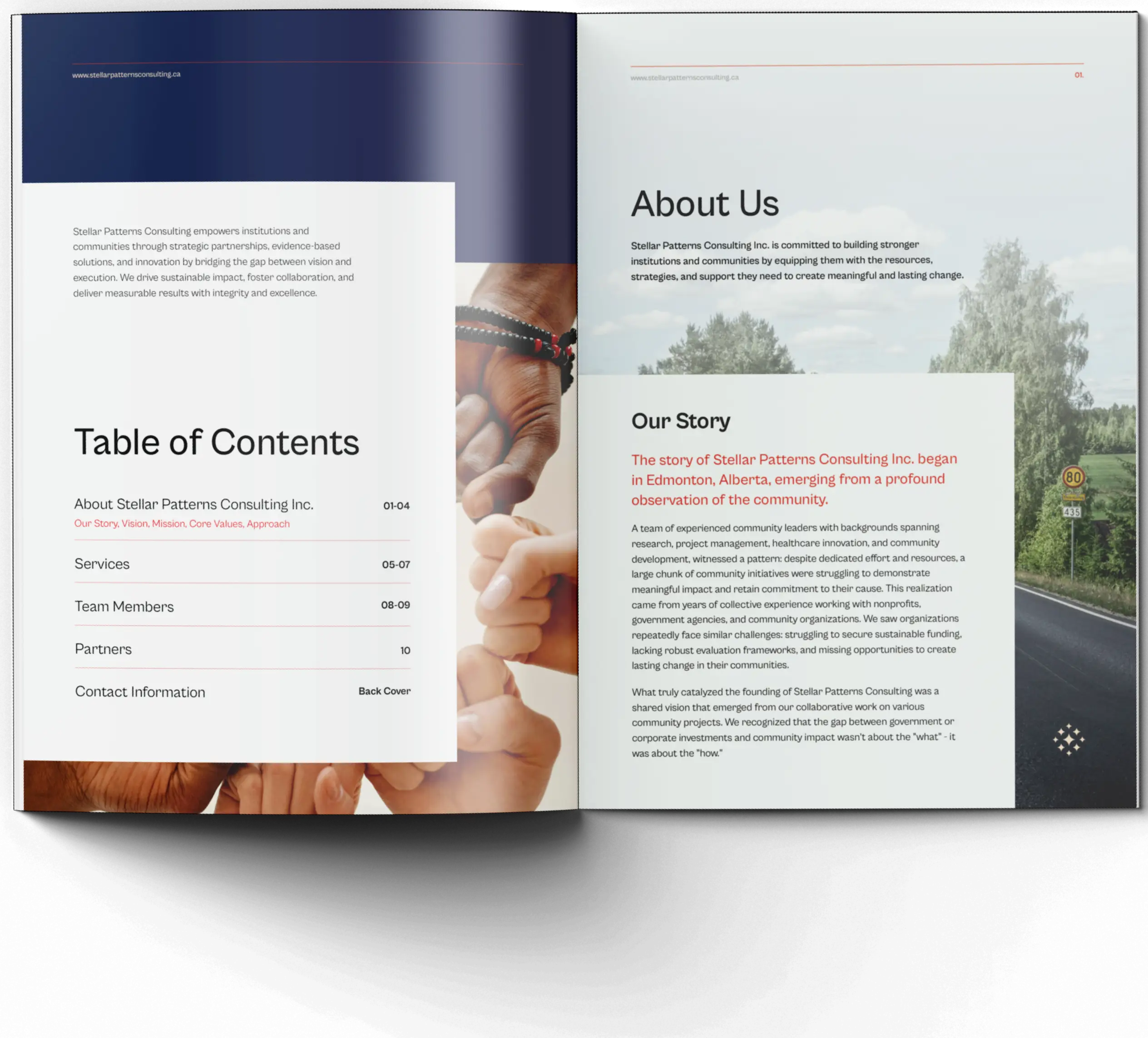
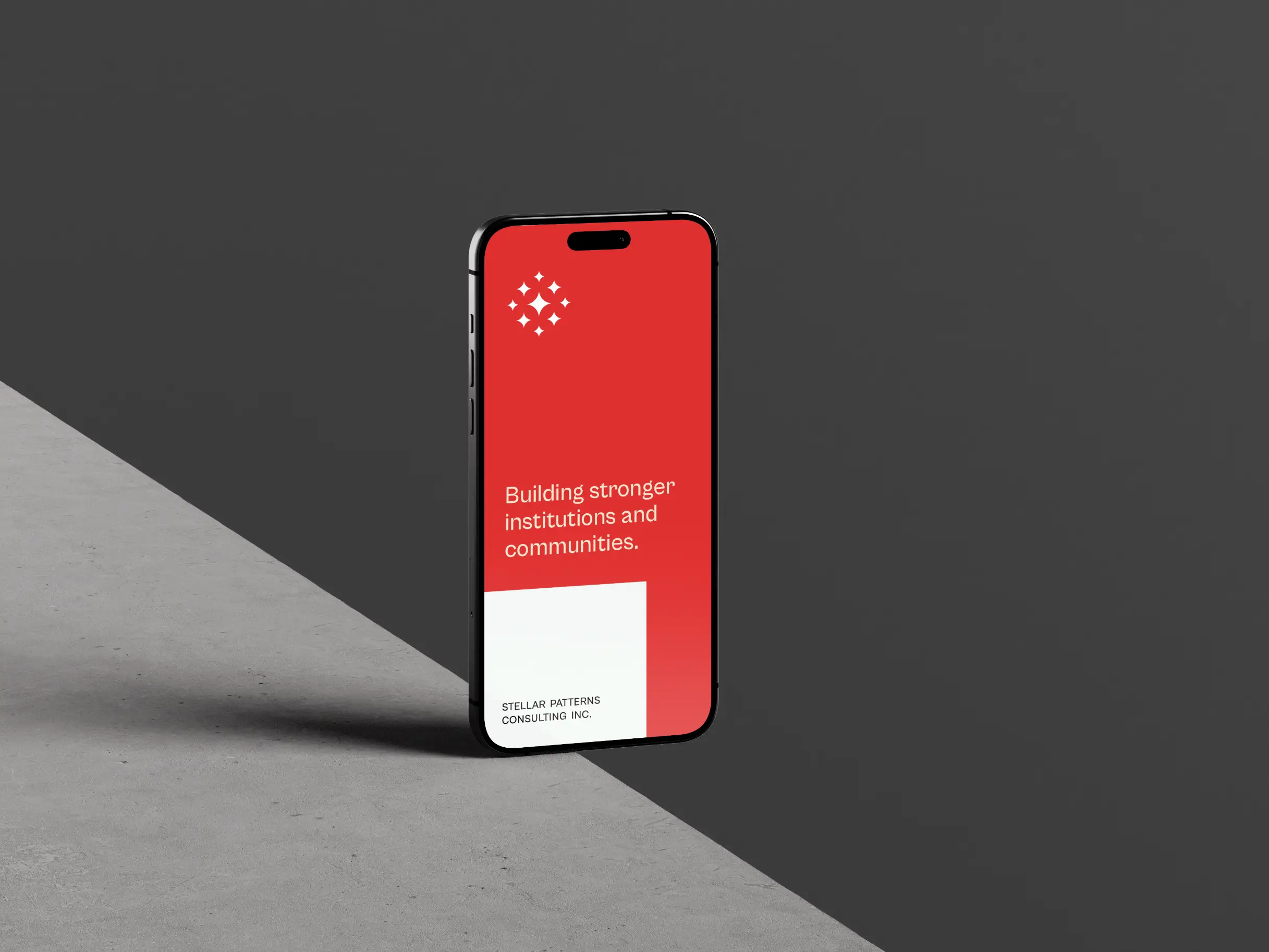
Stellar Patterns Consulting is a Canadian organization committed to building stronger institutions and communities through its core values of excellence and transformative impact.
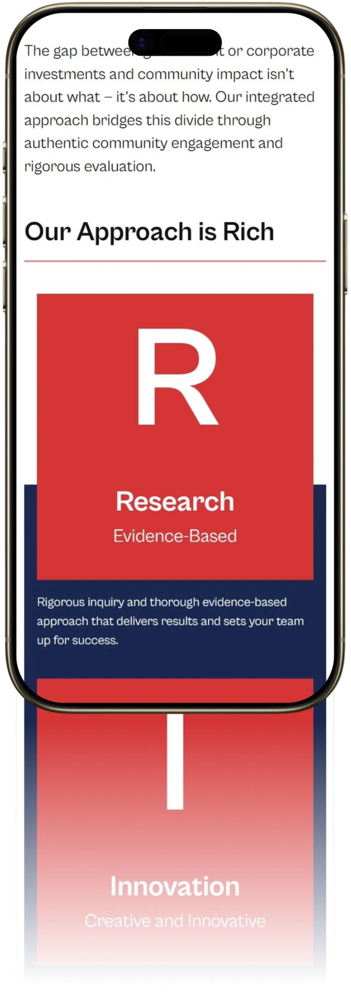
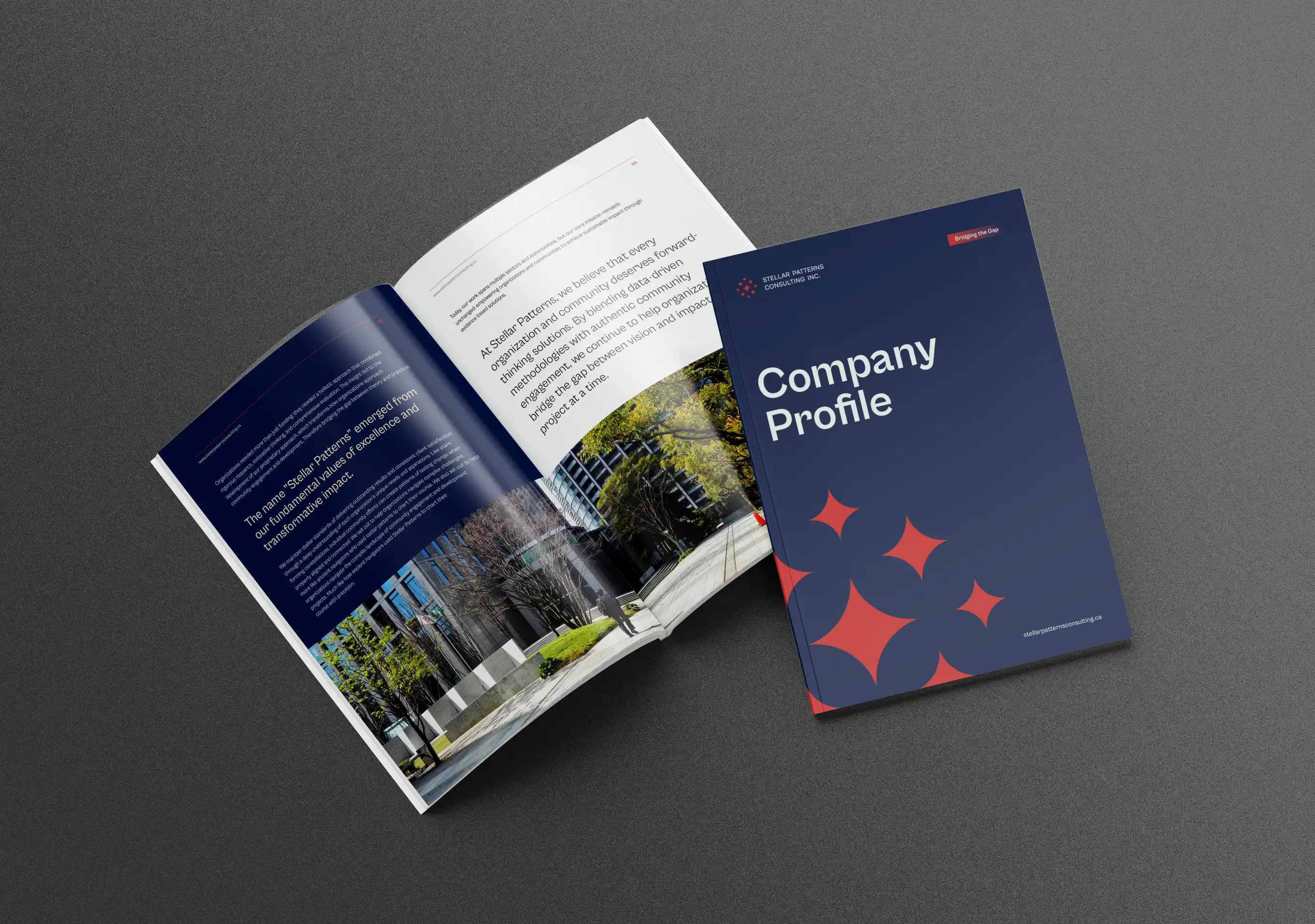
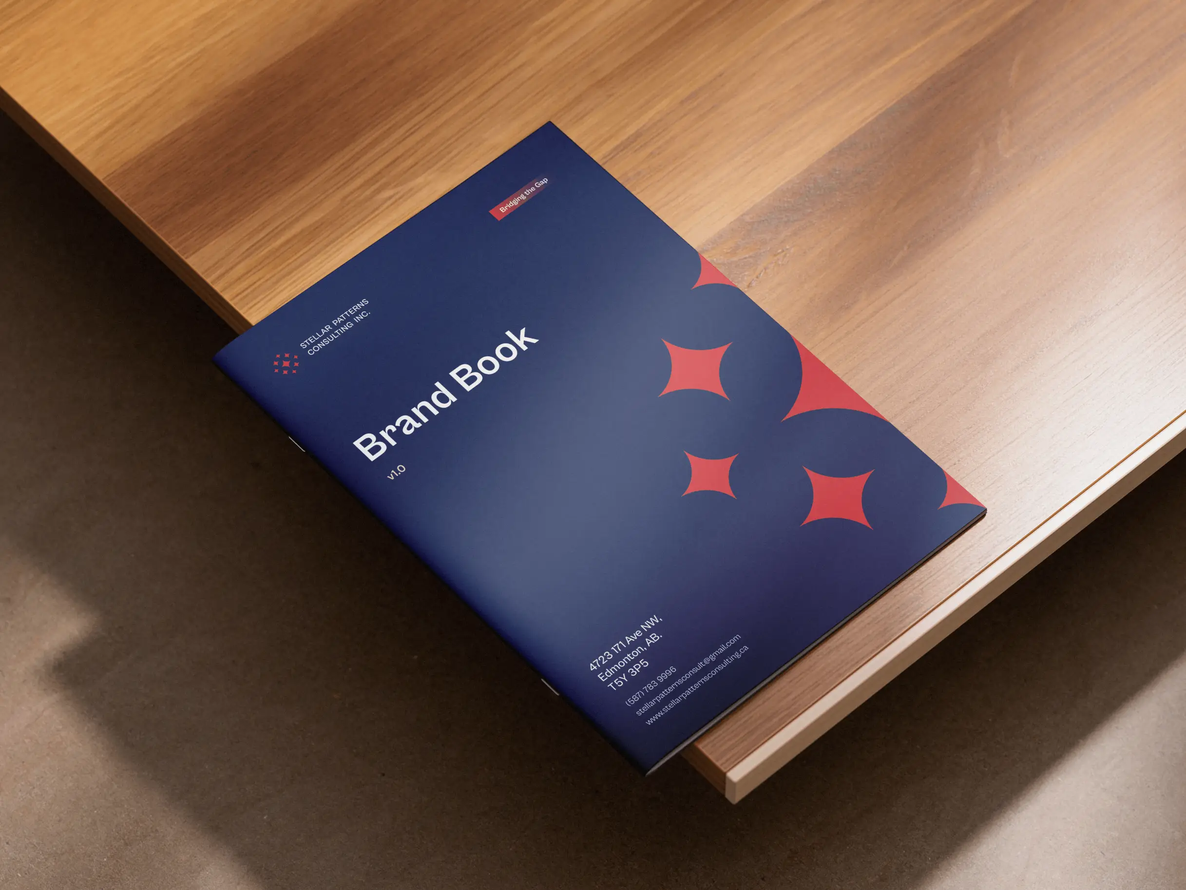
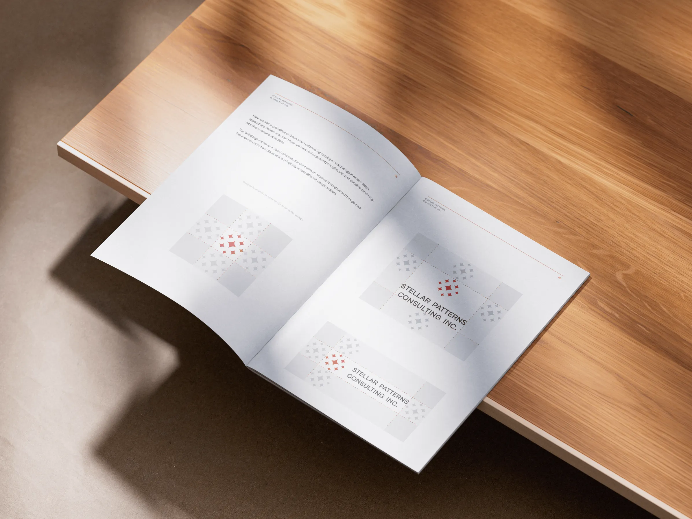
SPC wanted more than just a new look, they needed a brand and visual identity that commands attention, captures their drive for excellence and transformation, and adapts effortlessly from brand to screen.
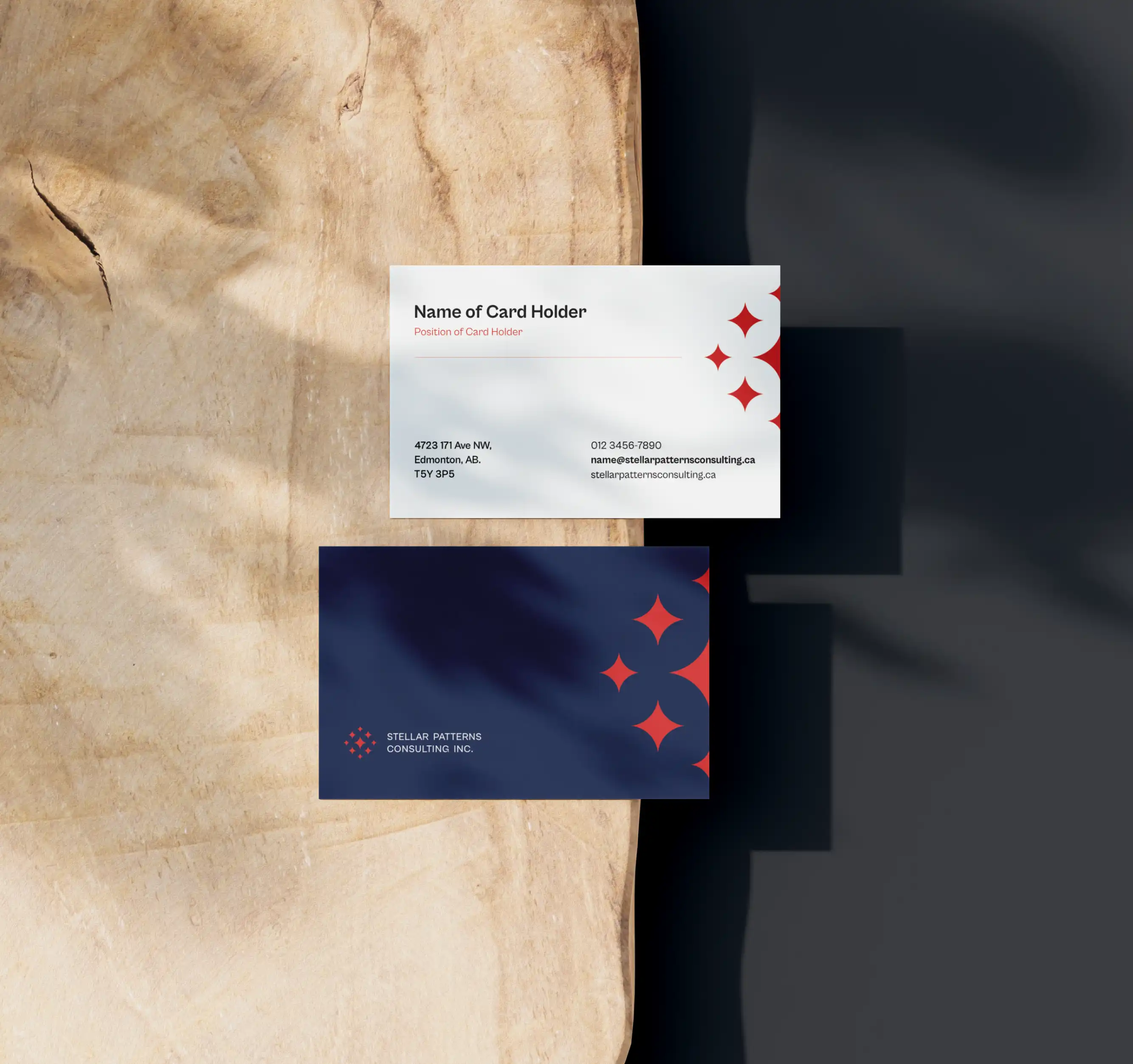
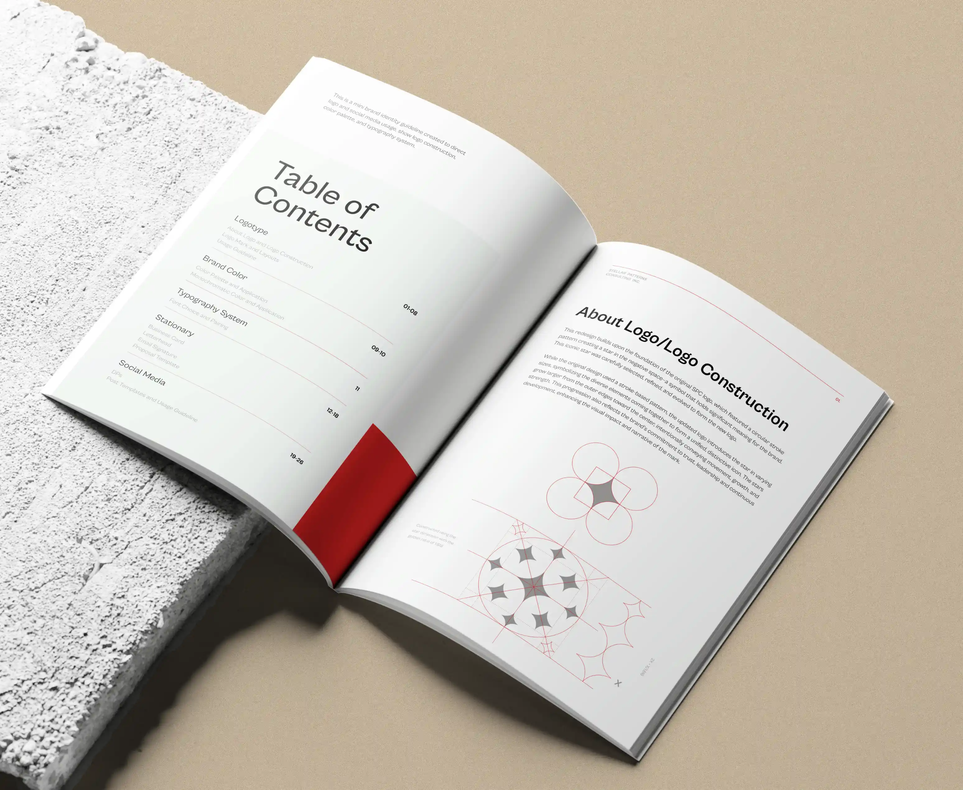
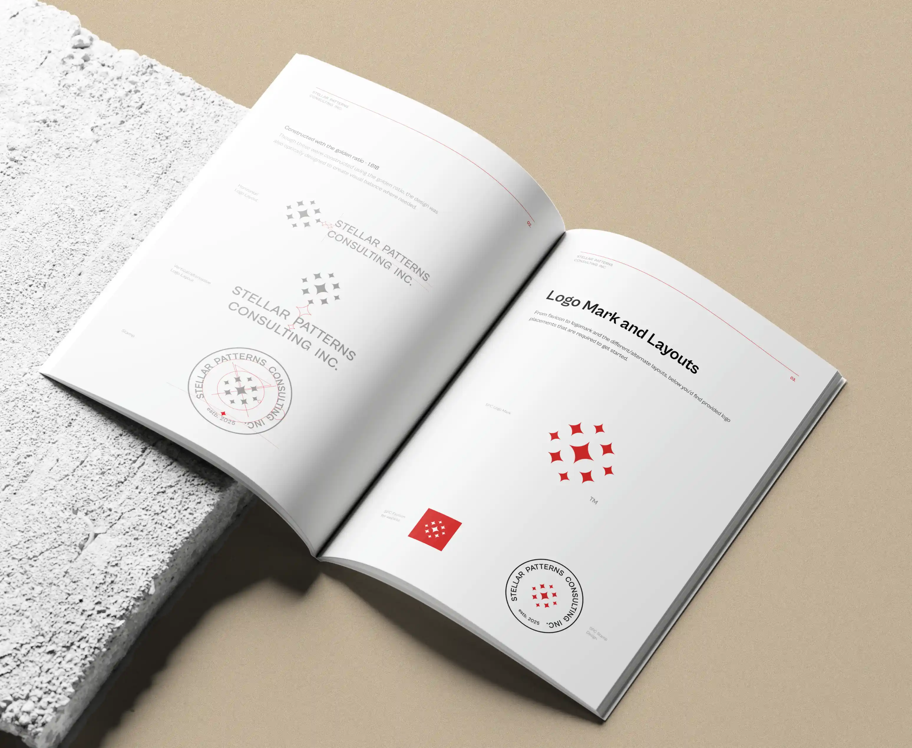
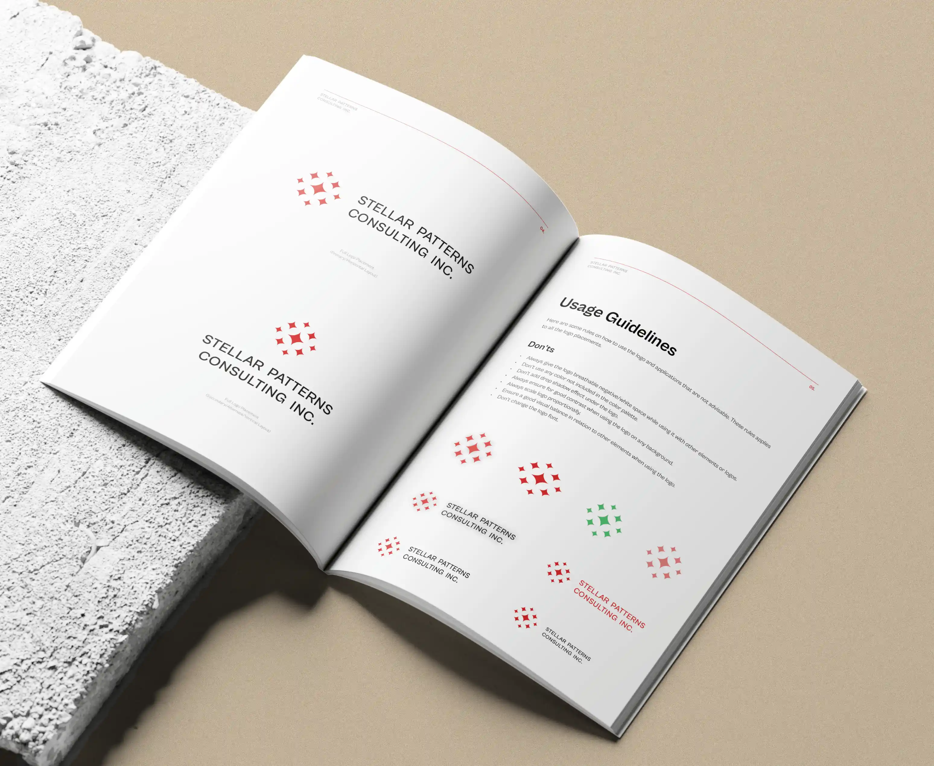
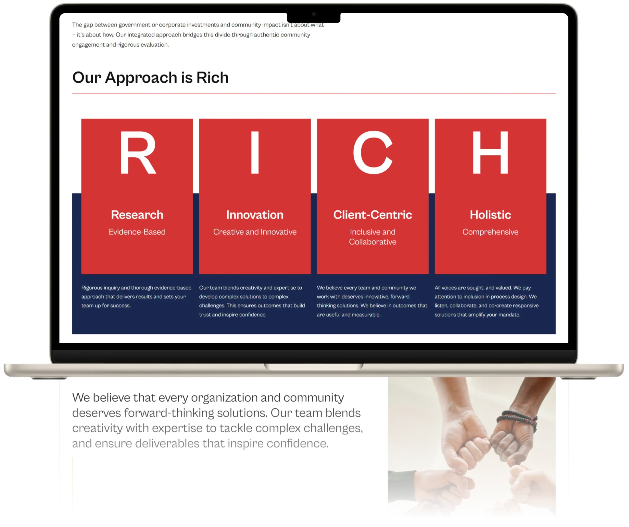
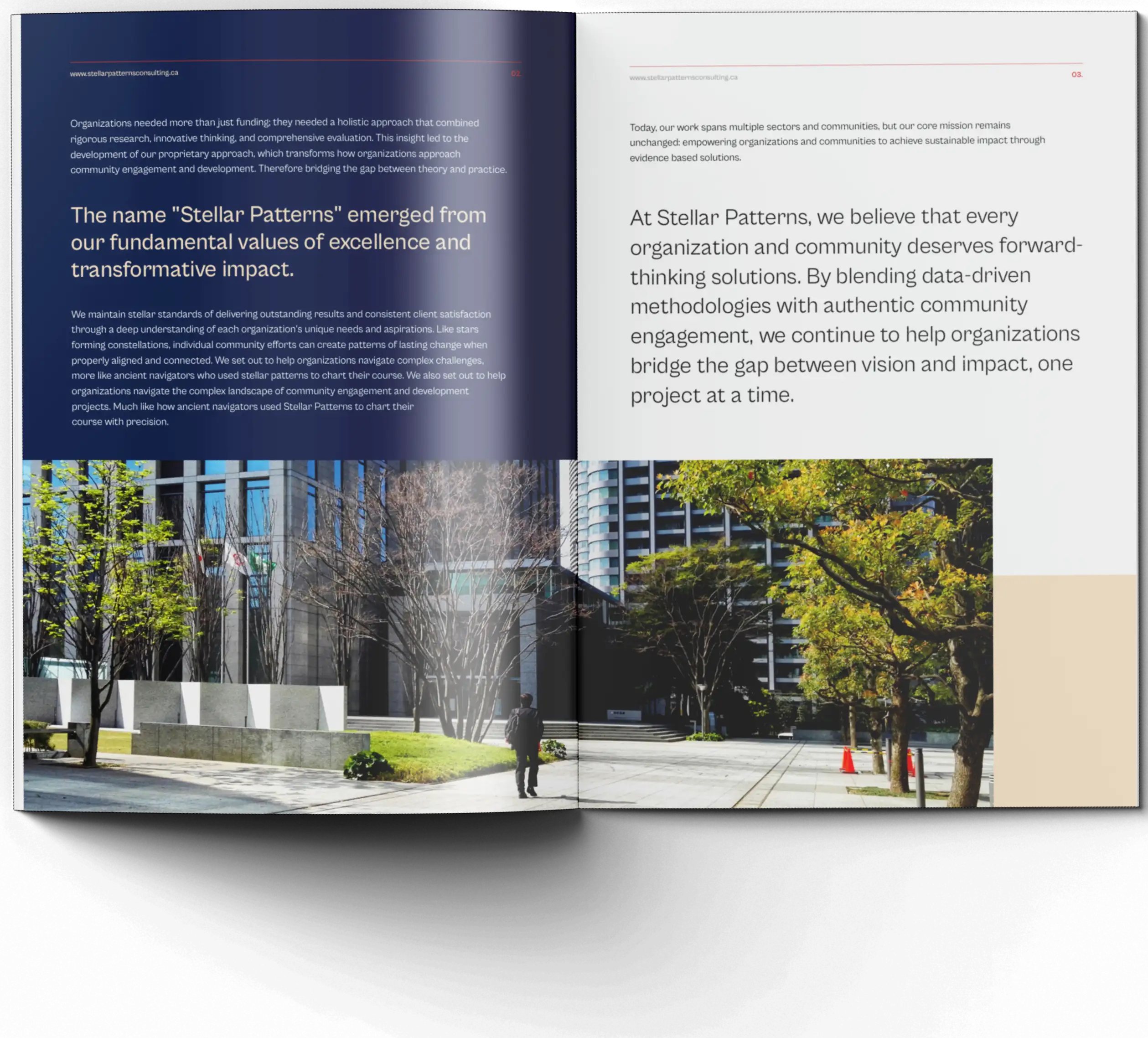
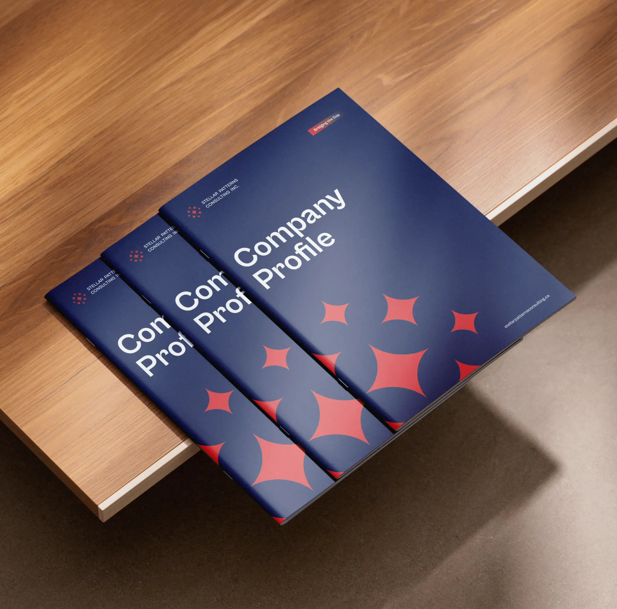
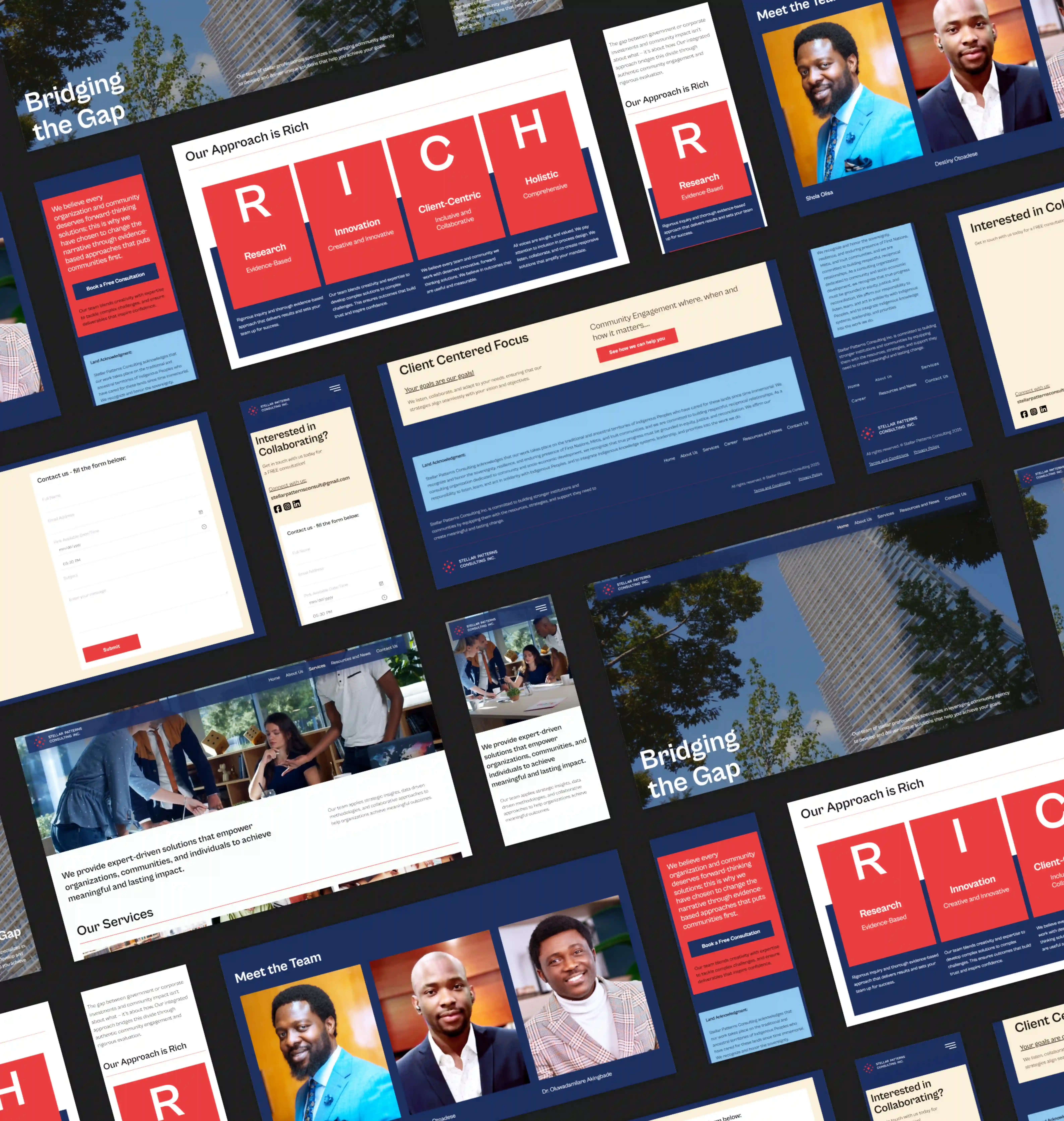
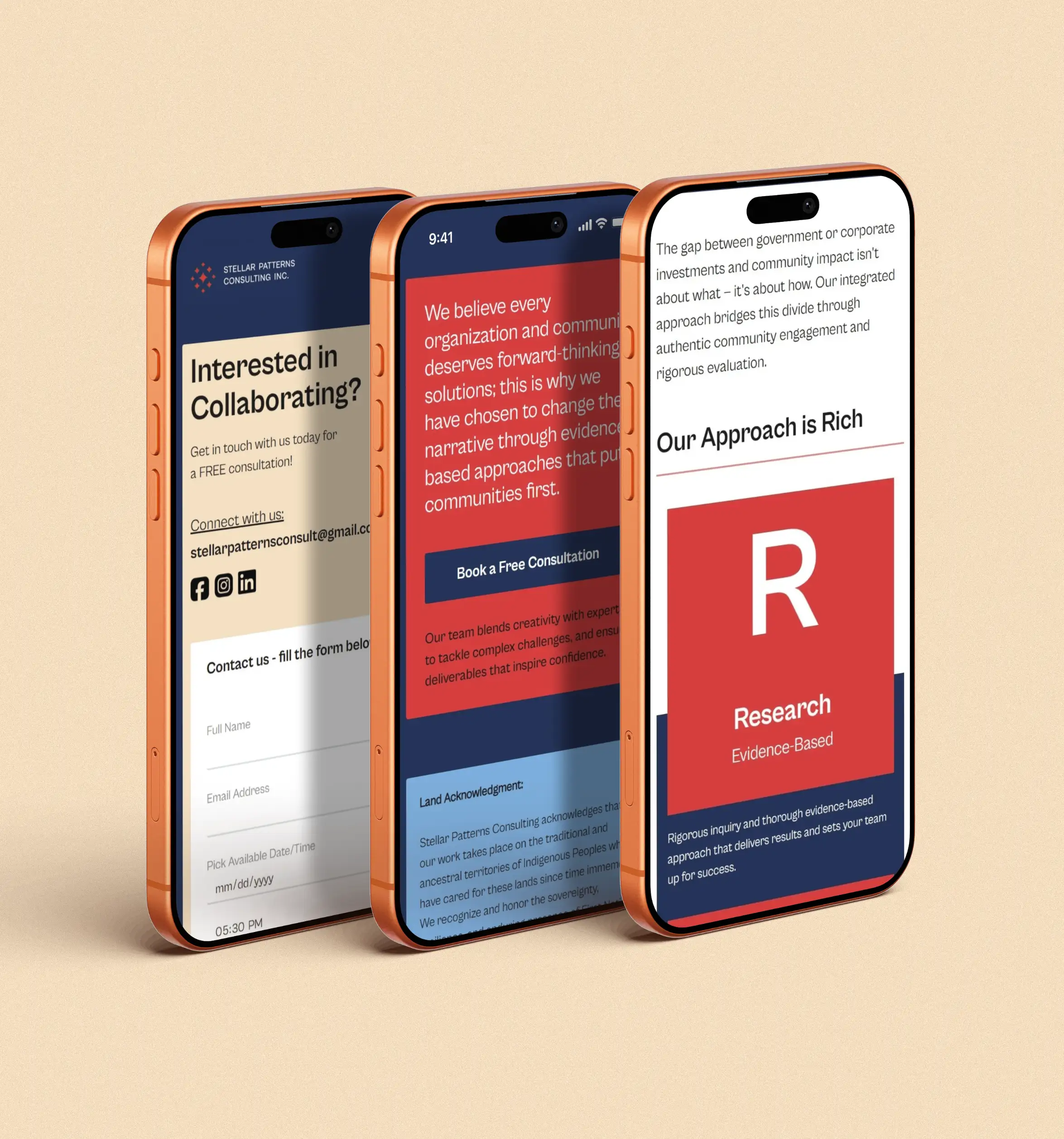
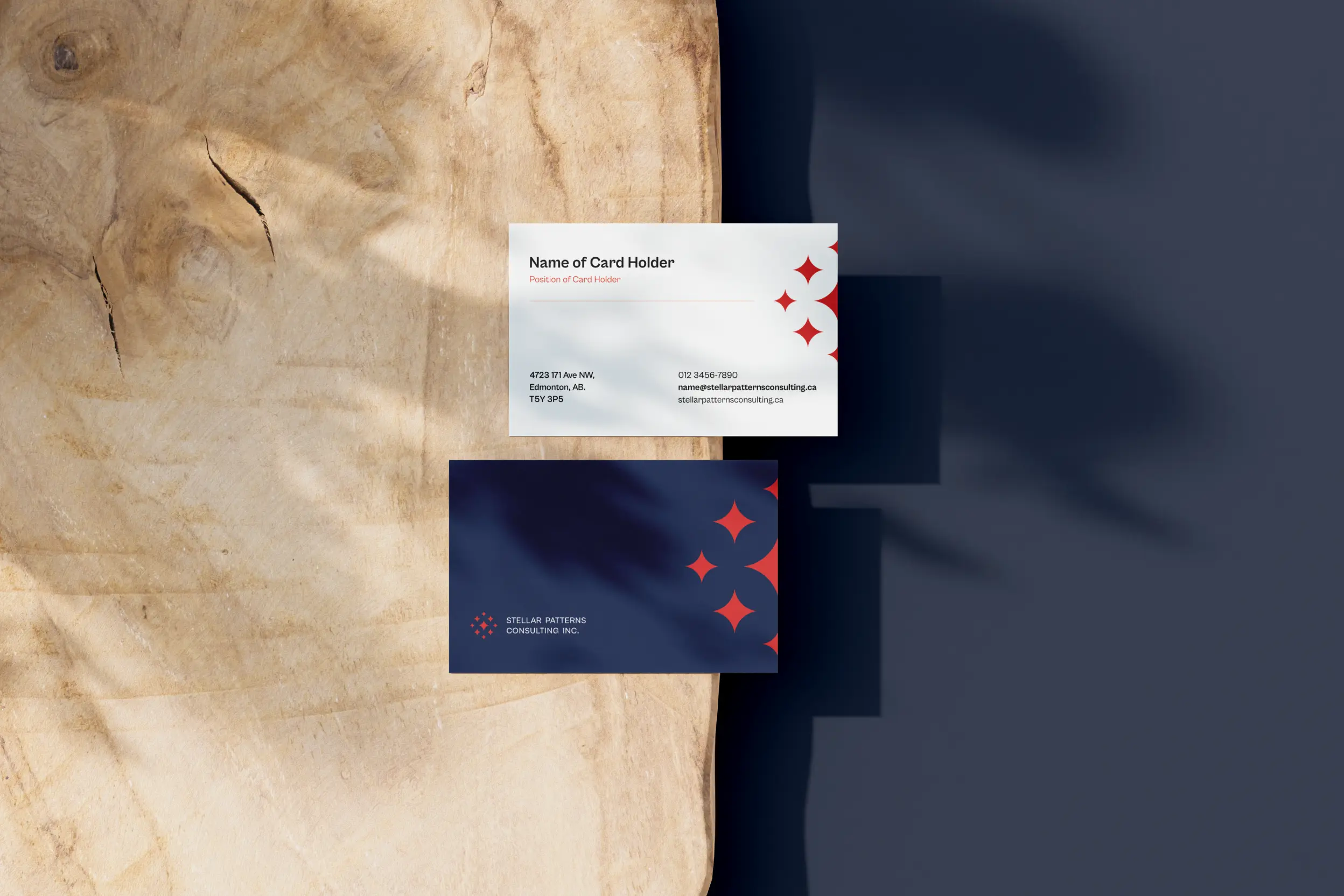
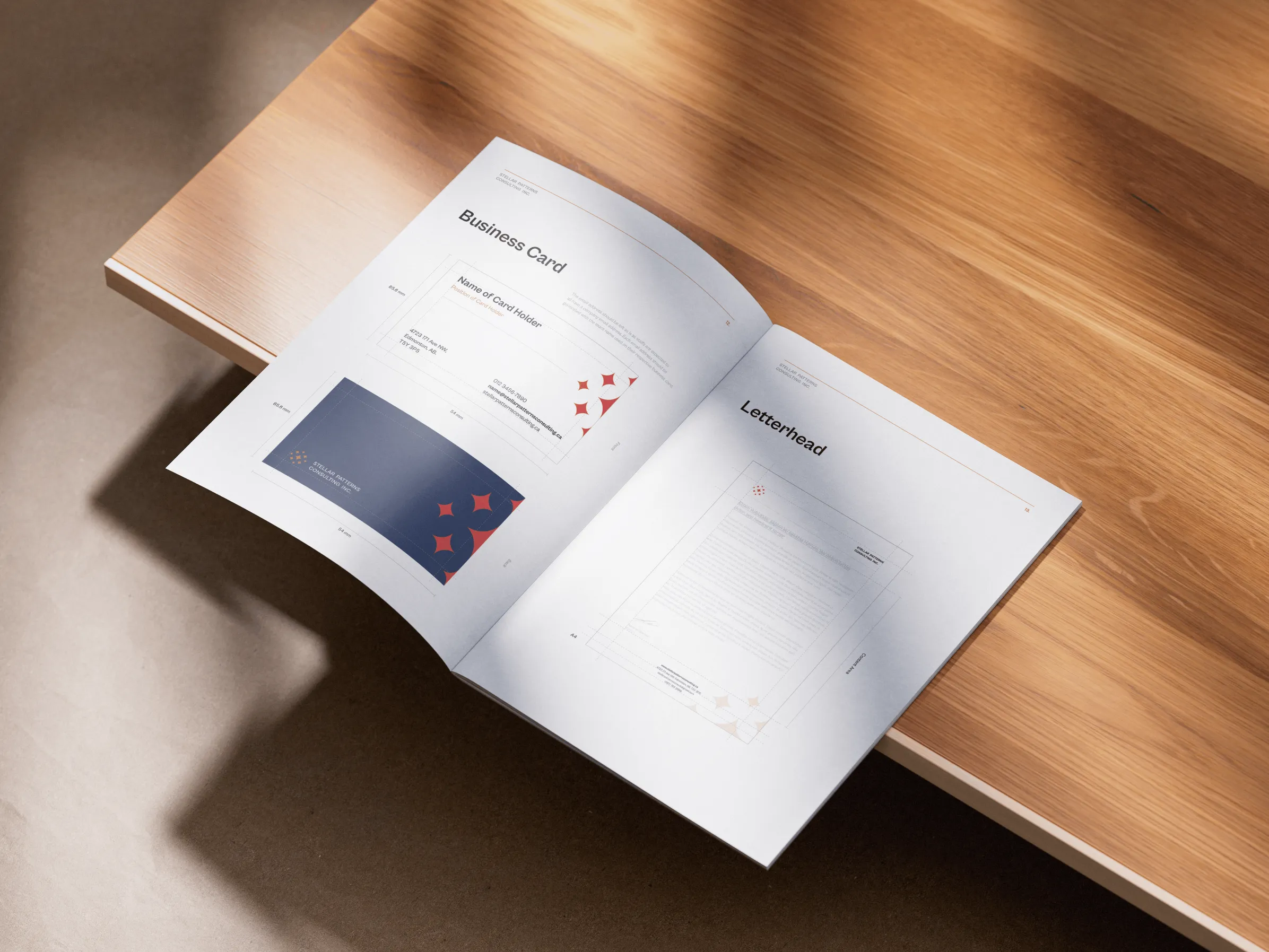
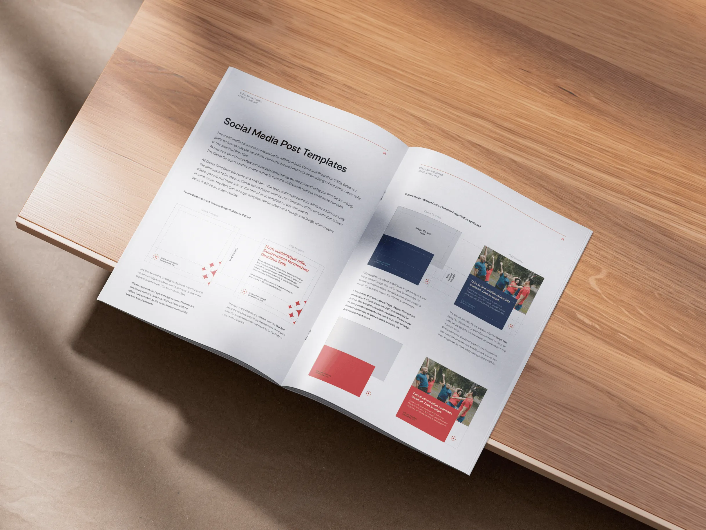
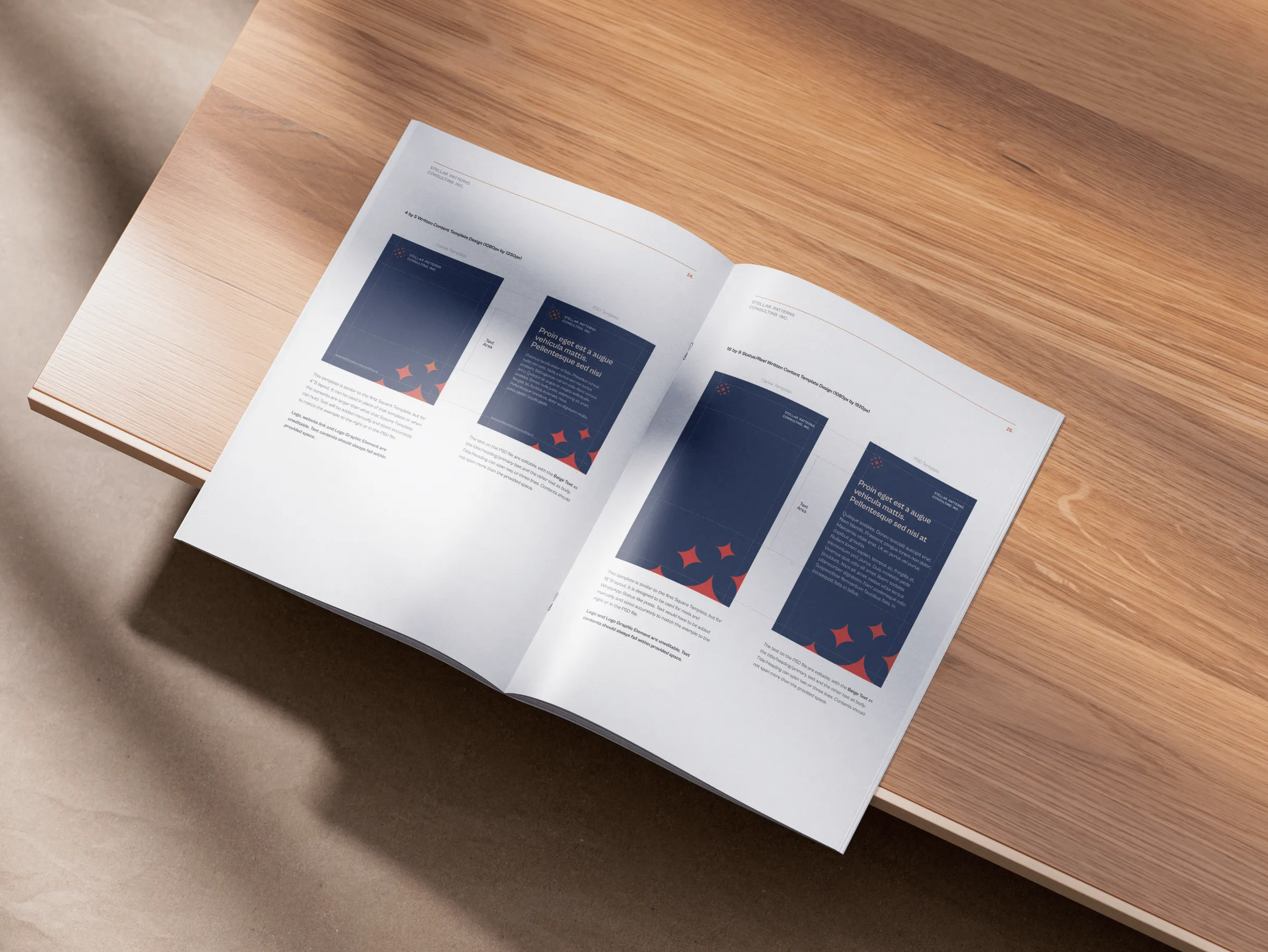
By partnering with them, we designed and developed a cohesive brand identity across digital and print that is bold, confident, and iconic, one that embodies trust and reinforces their ability to deliver transformative results.
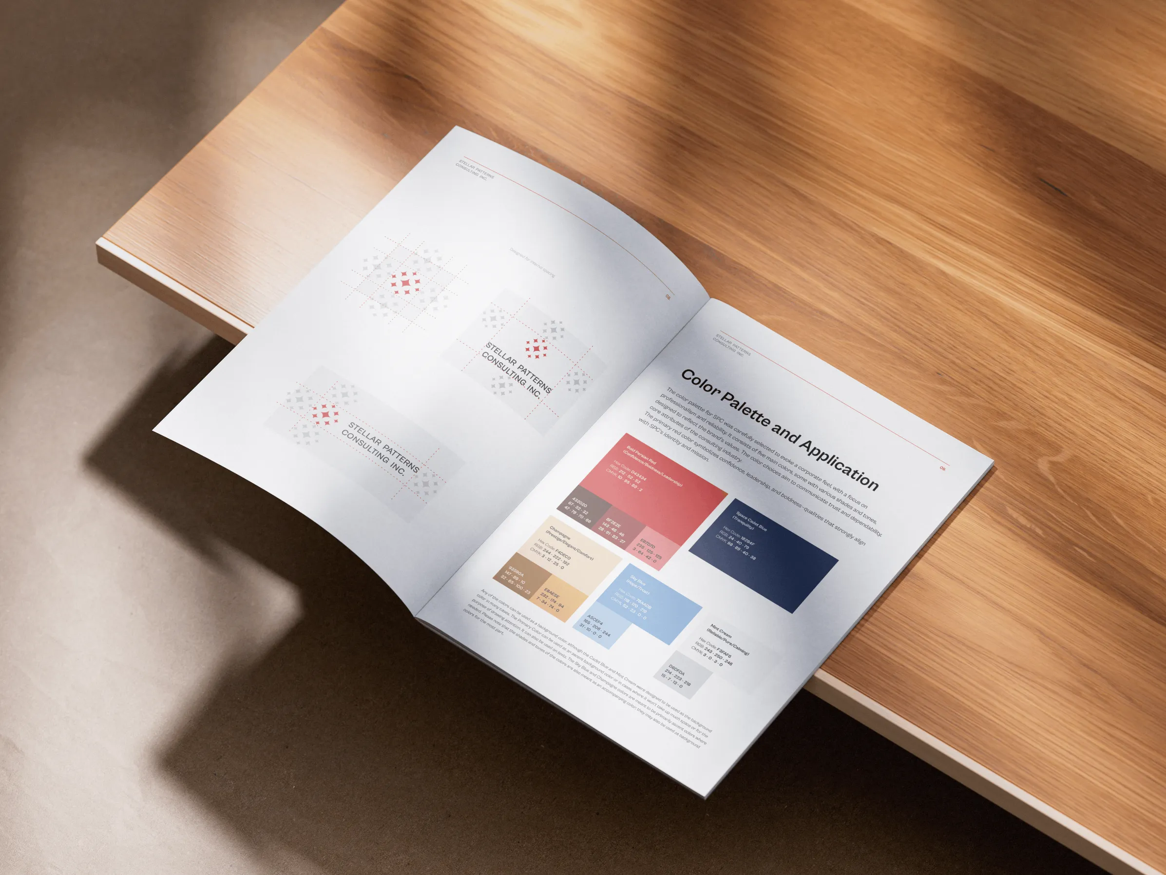
The color palette for SPC was carefully selected to communicate professionalism, trust and dependability. The primary red color symbolizes confidence, leadership, and boldness, qualities that strongly align with SPC’s identity and mission.
Refreshed web experience
View Safetynet Cyber Security Website Redesign ProjectDesigning a structured scientific report
View Institute of Control Scientists Report Design ProjectDesigning a brand for Impact
View SPDC Brand and Website Design Project